
Getting started with Ext JS 5 and Sencha Cmd 5 couldn’t be easier. Completing these two steps will result in a fully functional starter application that can be run on a local web server. Note that this also requires that a ruby command compatible with 1.8 or 1.9 is available on the system path.
2. Open your terminal or console window and issue these commands:
sencha generate app -ext MyApp ./app
    cd app
    sencha app watch
If you’d like to use a local copy of the framework, you may replace the above ‘generate’ command with:
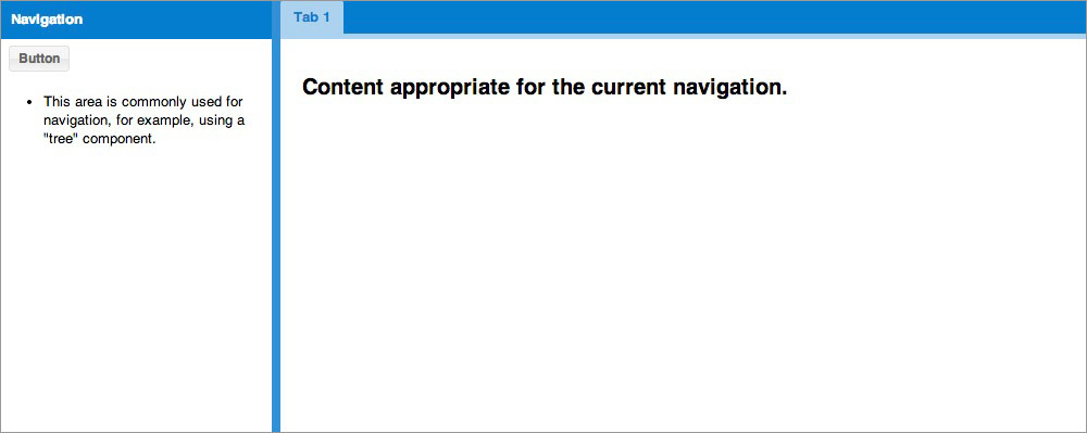
sencha -sdk /path/to/framework generate app MyApp ./appThat’s it. You’ve created an application and deployed a server. Now navigate to http://localhost:1841 or your native localhost. You can now view your newly generated Ext JS 5 application. It should look something like this:
Sencha Cmd is now monitoring your application for changes. You will see “Waiting for changes…” , which is an indication that your application is up to date. As you make changes and save files you will see other messages printing, but these will end shortly with another “Waiting for changes…” message. This cycle usually takes a few seconds, so be sure to allow enough time between file saves and hitting Reload in your browser.
Note: If you’re curious about what the above steps entail, you may want to check out our Introduction to Sencha Cmd Guide.
Next Steps
It’s not much use having an application that consists of two empty containers, so let’s make this example a little more interesting.
Title in the North Region
The generated application scaffolding is built using a border layout, which gives us “regions” based on cardinal directions. The main tab area is the “center” region and the empty panel titled “west” is the “west” region.
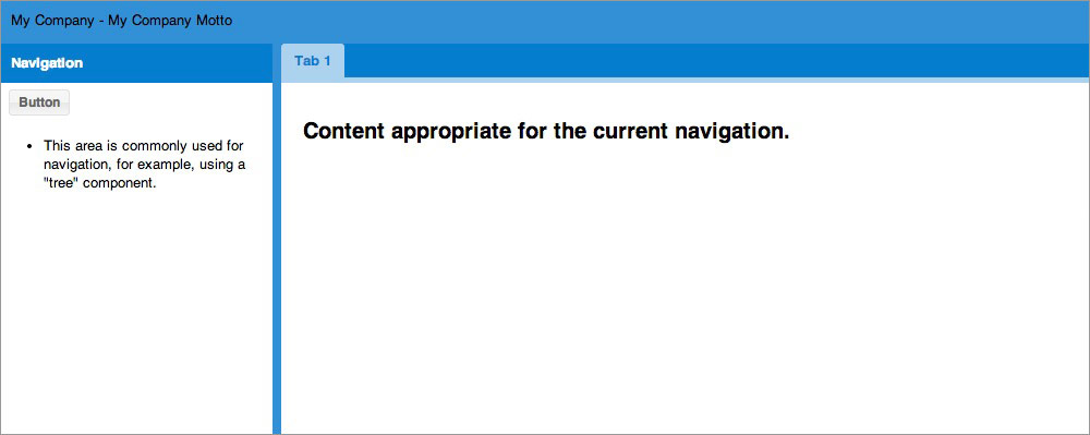
Every good application needs appropriate branding, so let’s personalize this application by adding a company title.
Using your favorite IDE or text editor, open
app/view/main/Main.js
. This is the container that currently holds the border layout that we discussed previously.
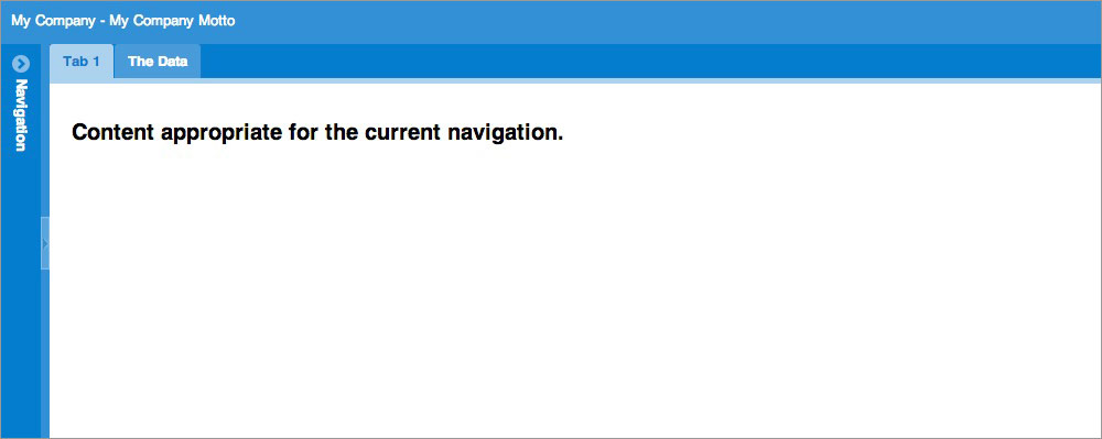
Let’s go ahead and add another item to the items array. Here is a new component with a north region. We’ve added a height of 40px, 10px of padding, and the text: ‘My Company - My Company Motto’:
{
    region: 'north',
    xtype: 'component',
    padding: 10,
    height: 40,
    html: 'My Company - My Company Motto'
}
Your items array in Main.js should now look like this:
[{
    region: 'north',
    xtype: 'component',
    padding: 10,
    height: 40,
    html: 'My Company - My Company Motto'
},
{
    xtype: 'panel',
    title: 'Navigation',
    region: 'west',
    html: '<ul><li>This area ...</li></ul>',
    width: 250,
    split: true,
    tbar: [{
        text: 'Button',
        handler: 'onClickButton'
    }]
},{
    region: 'center',
    xtype: 'tabpanel',
    items:[{
        title: 'Tab 1',
        bodyPadding: 20,
        html: '<h2>Content...</h2>'
    }]
}]
Save your Main.js file with these changes. This will be the first time you will see “sencha app watch” in action. When the content of this file changes, app watch will detect the change and execute a special set of build steps. Once you see “Waiting for changes…” again, you can refresh your application. You should now see your newly added north region.
That looks a little better, but it’s pretty hard to read. Let’s try and get that text to “pop” a bit more.
There’s a number of methods in which styles can be modified. The first method is great for very targeted situations. For instance, let’s say you just want to make that particular text white and be done with it. No other application colors need to change, and you only care about that bit of black text. In that case, it may make the most sense to simply add a class config (cls) to your north region like this:
{
    region: 'north',
    xtype: 'component',
    cls: 'appBanner',
    padding: 10,
    height: 40,
    html: 'My Company - My Company Motto'
}
You can then add that class to any included CSS file and give it a color of white.
.appBanner{
    color:#ffffff;
}
You can include a CSS file by creating it and then adding it to your app.json’s CSS object.
What if you want to have a little more global control over your application’s design? In that case, you will probably want to modify your SCSS files.
SCSS (Sassy CSS) is a syntax of SASS, which allows you to add nested rules, variables and mixins to your design code. These new additions are then processed and converted to traditional CSS files for your application’s consumption.
To see a list of global SCSS variables, check out this page from our API docs: Global_CSS
Individual components also have specific SCSS variables for you to change. For instance, you can view specific Panel SCSS variables by visiting the Panel API page: Ext.panel.Panel
The first thing we want to do is create a file called
Main.scss
in
sass/var/view/main
. Some of those folders will not exist yet, but they will be picked up by
sencha app watch
when you add them. You may wonder why we’re adding a
Main.scss
file.
For each class in your application, Sencha Cmd checks for a corresponding SCSS file in
sass/var/
for variables, and
sass/src/
for rules. Since the application has a class named
MyApp.view.main.Main
, the
sass/var/view/main/Main.scss
file gets included in the build if you add it. You could also target any other view by creating a
{ViewName}.scss
file under
sass/var/view/{namespace}/{ViewName}.scss
. It’s all up to you and how you want your SCSS rules to be applied and organized.
In this instance, it would probably make the most sense to extract the north region into its own class definition. Then you could target that toolbar specifically without apply SCSS rules to anything else in the view. However, this illustrates the point without delving too deeply into application structure.
Now, you can add the following variable to the first line of your currently empty
Main.scss
file:
$color: #ffffff;Once the change is picked up, refresh your page and see that your text is now white (#ffffff). We’re doing a simple text color change, but you can change pretty much anything via SASS variables.

Collapsible West Region
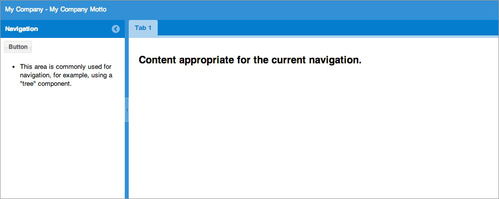
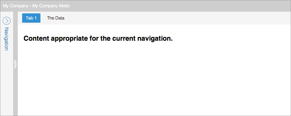
Now that we have some brand identification, let’s play around with some other configurations. That west panel is kind of burdensome now, so let’s give the user some manner of getting it out of the way. The Panel class allows us to set a property called ‘collapsible’. So let’s go to the west region panel, and add collapsible: true. Your Main.js west region code should now look like this:
{
    xtype: 'panel',
    title: 'Navigation',
    region: 'west',
    html: '<ul><li>This area...</li></ul>',
    width: 250,
    split: true,
    collapsible: true,
    tbar: [{
        text: 'Button',
        handler: 'onClickButton'
    }]
}
Upon refreshing, you should now see that your panel has a small collapsible button.
Then upon collapsing, the application should look like this:
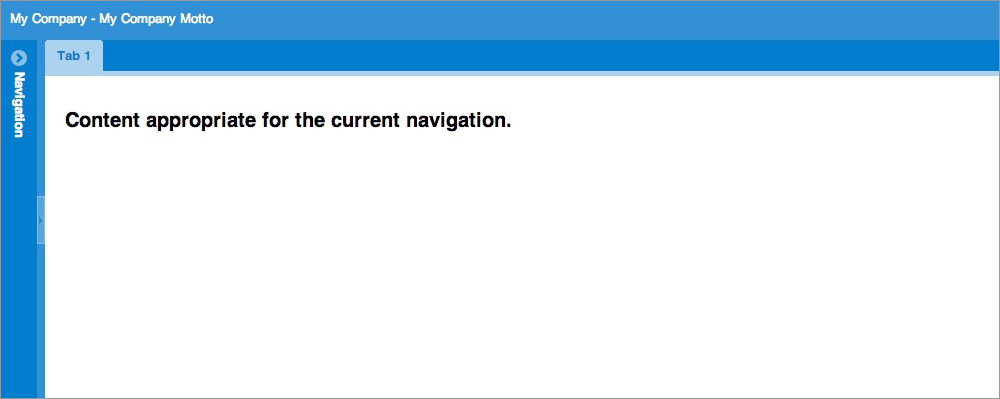
Perhaps you’d like your west region to start off collapsed instead. You guessed it, the west region item supports a ‘collapsed’ property. So let’s set collapsed: true.
{
    xtype: 'panel',
    title: 'Navigation',
    region: 'west',
    html: '<ul><li>This area...</li></ul>',
    width: 250,
    split: true,
    collapsible: true,
    collapsed: true,
    tbar: [{
        text: 'Button',
        handler: 'onClickButton'
    }]
}
Tabs and Grids
Our application is starting to take shape, but there’s only one tab in our center region. That doesn’t make much sense. If we’re going to have a tabpanel, we should probably have at least two tabs. Let’s add another tab with some helpful information. We add tabs by appending another item to the tabpanel items array.
{
    region: 'center',
    xtype: 'tabpanel',
    items: [{
        title: 'Tab 1',
        bodyPadding: 20,
        html: '<h2>Content...</h2>'
    },{
        title: 'The Data'
    }]
}
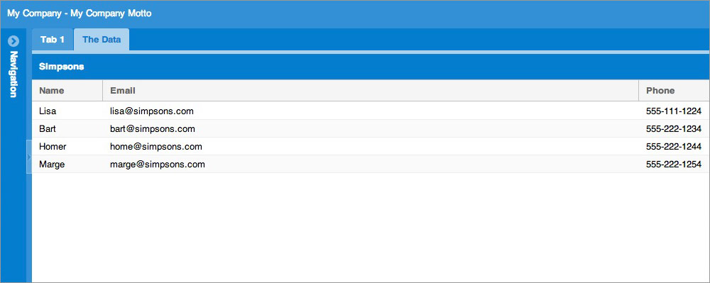
Great! Now we have two tabs. But the second tab is empty. Ext JS is really great at displaying complex data in a simple to read manner. Let’s check out the Grid component and add that to our second tab.
The grid is really composed of four things. The grid itself, the store which houses and organizes the data records, a model which “models” the data for the store, and the data itself. In a real application, you would have all of these split out in the traditional MVC architecture, but for this example, we’ll keep everything in-line.
I’ve modified the 2nd tab to contain a grid, with a store, field definitions, and some data. My second tab now looks something like this:
{
    title: 'The Data',
    layout: 'fit',
    items: [{
        xtype: 'grid',
        title: 'Simpsons',
        store: {
            fields:['name', 'email', 'phone'],
            data:[
                { name: 'Lisa',  email: "lisa@simpsons.com",
                  phone: "555-111-1224"  },
                { name: 'Bart',  email: "bart@simpsons.com",
                  phone: "555-222-1234" },
                { name: 'Homer', email: "home@simpsons.com",
                  phone: "555-222-1244"  },
                { name: 'Marge', email: "marge@simpsons.com",
                  phone: "555-222-1254"  }
            ],
            proxy: {
                type: 'memory'
            }
        },
        columns: [
            { text: 'Name',  dataIndex: 'name' },
            { text: 'Email', dataIndex: 'email', flex: 1},
            { text: 'Phone', dataIndex: 'phone' }
        ]
    }]
}
It may look like we’ve added a lot of code here, but we’ve just created a fully functional grid. By default, each column is sortable and will toggle between ASC and DESC sorting when you click on its header. Each column header is also re-orderable by default, and each gains a drop-down menu with options to hide and show columns. Not only that, but it’s incredibly easy to configure each column independently. Upon reloading your application, you should see something like this:
Note:
If
sencha app watch
fails to pick up your changes for any reason, you can simply stop (CTRL + c) and restart.
There are a few things to note about the code above.
Layouts
The layout system is one of the most powerful parts of Ext JS. It handles the sizing and positioning of every Component in your application. There are many possible layouts in Ext JS, but as you can see, this panel has a layout of “fit”.
A fit layout means that the item will automatically expand to fill its container. This is very handy when you don’t want to specifically set a width or height.
Store
In a real world situation, the above store would have a proxy with a url property. The proxy would most likely be pulling information from a server. We are keeping the data in-line in this example for the sake of visualization. However, most situations would not call for having in-line data.
Change Themes
We’ve added a lot of neat functionality. Now let’s focus on the look and feel of the application. The default theme is generated with every new application unless told otherwise. That said, it’s incredibly easy to swap themes once your application has been created.
Let’s try out the Ext JS Crisp theme.
All you need to do is open your app.json file in your projects root and add the following line anywhere in the file:
"theme": "ext-theme-crisp"Once the build has completed, refresh the page, and you should see that your application has gotten a facelift.
Wrap Up
Now you see how easy it is to get an application up and running using Ext JS and Sencha Cmd. Make sure to check out the API docs for all of the components and classes that we explored throughout this walkthrough.