
Ext.grid.Panel is one of the centerpieces of Ext JS. It’s an incredibly versatile component that provides an easy way to display, sort, group, and edit data.
Basic Grid Panel
Let’s get started by creating a basic Ext.grid.Panel . Here’s all you need to know to get a simple grid up and running:
Model and Store
Ext.grid.Panel is simply a component that displays data contained in a Ext.data.Store . Ext.data.Store can be thought of as a collection of records, or Ext.data.Model instances.
The benefit of this setup is separating our concerns. Ext.grid.Panel is only concerned with displaying the data, while Ext.data.Store takes care of fetching and saving the data using Ext.data.proxy.Proxy .
First, we need to define a Ext.data.Model . A model is just a collection of fields that represents a type of data. Let’s define a model that represents a “User”:
Ext.define('User', {
    extend: 'Ext.data.Model',
    fields: [ 'name', 'email', 'phone' ]
});
Next let’s create a
Ext.data.Store
that contains several
User
instances.
var userStore = Ext.create('Ext.data.Store', {
    model: 'User',
    data: [
        { name: 'Lisa', email: 'lisa@simpsons.com', phone: '555-111-1224' },
        { name: 'Bart', email: 'bart@simpsons.com', phone: '555-222-1234' },
        { name: 'Homer', email: 'homer@simpsons.com', phone: '555-222-1244' },
        { name: 'Marge', email: 'marge@simpsons.com', phone: '555-222-1254' }
    ]
});
For sake of ease, we configured Ext.data.Store to load its data inline. In a real world application, you would most likely configure the Ext.data.Store to use a Ext.data.proxy.Proxy to load data from the server.
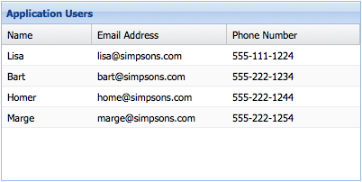
Grid Panel
Now, we have a model, which defines our data structure. We have also loaded several model instances into Ext.data.Store . Now we’re ready to display the data using Ext.grid.Panel .
In this example, we configured the grid with renderTo to immediately render the grid into the HTML document.
In many situations, the grid will be an ancestor of Ext.container.Viewport , which means rendering is already handled.
Ext.create('Ext.grid.Panel', {
    renderTo: Ext.getBody(),
    store: userStore,
    width: 400,
    height: 200,
    title: 'Application Users',
    columns: [
        {
            text: 'Name',
            width: 100,
            sortable: false,
            hideable: false,
            dataIndex: 'name'
        },
        {
            text: 'Email Address',
            width: 150,
            dataIndex: 'email',
            hidden: true
        },
        {
            text: 'Phone Number',
            flex: 1,
            dataIndex: 'phone'
        }
    ]
});
And that’s all there is to it.
We just created a
Ext.grid.Panel
that renders itself to the body element. We also told the grid panel to get its data from the
userStore
that we previously created.
Finally, we defined the Grid Panel’s columns and gave them a
dataIndex
property. This
dataIndex
associates a field from our Model to a column.
The
Name
column has a fixed width of
100px
and has sorting and hiding disabled. The
Email Address
column is hidden by default (it can be shown again by using the menu on any other column). Finally, the
Phone Number
column flexes to fit the remainder of the Grid Panel’s total width.
For a larger example, see the Array Grid Example .
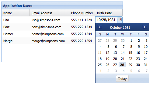
Renderers
You can use the
renderer
property of the column config to change the way in which data is displayed. A renderer is a function that modifies the underlying value and returns a new value for display. Some of the most common renderers are included in
Ext.util.Format
, but you can write your own as well:
columns: [
    {
        text: 'Birth Date',
        dataIndex: 'birthDate',
        // format the date using a renderer from the Ext.util.Format class
        renderer: Ext.util.Format.dateRenderer('m/d/Y')
    },
    {
        text: 'Email Address',
        dataIndex: 'email',
        // format the email address using a custom renderer
        renderer: function(value) {
            return Ext.String.format('<a href="mailto:{0}">{1}</a>', value, value);
        }
    }
]
See the Kitchen Sink’s Array Grid for a live demo that uses custom renderers.
Grouping
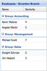
Organizing the rows into groups is easy. First we specify a Ext.data.Store#groupField property on our store:
Ext.create('Ext.data.Store', {
    model: 'Employee',
    data: ...,
    groupField: 'department'
});
Next we configure a grid with a Ext.grid.feature.Feature that will handle displaying the rows in groups:
Ext.create('Ext.grid.Panel', {
    ...
    features: [{ ftype: 'grouping' }]
});
See the Kitchen Sink’s Grouping Grid Panel for a live example.
Selection Models
Grid Panels can be used to simply display data. However, it is often necessary to interact with the grid’s data. All Grid Panel’s have a Ext.selection.Model , which determines how data is selected. The two main types of Selection Model are Ext.selection.RowModel , where entire rows are selected, and Ext.selection.CellModel , where individual cells are selected.
Grid Panels use Ext.selection.RowModel by default, but it’s easy to switch to a Ext.selection.CellModel :
Ext.create('Ext.grid.Panel', {
    selType: 'cellmodel',
    store: ...
});
Using Ext.selection.CellModel changes a couple of things. Firstly, clicking on a cell now selects just that cell as opposed to the entire row. Secondly, the keyboard navigation will walk from cell to cell instead of row to row. Cell-based selection models are usually used in conjunction with editing.
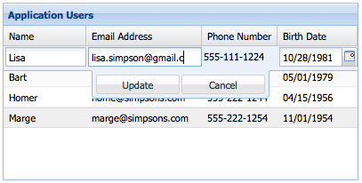
Editing
Grid Panel has built-in support for editing. Let’s look at the two main editing modes - row editing and cell editing.
Cell Editing
Cell editing allows you to edit the data in a Grid Panel one cell at a time. The first step in implementing cell editing is to configure an editor for each Ext.grid.column.Column in your Grid Panel that should be editable. This is done using the Ext.grid.column.Column#editor config. The simplest way is to specify just the xtype of the field you want to use as an editor:
Ext.create('Ext.grid.Panel', {
    ...
    columns: [
        {
            text: 'Email Address',
            dataIndex: 'email',
            editor: 'textfield'
       }
    ]
});
If you need more control over how the editor field behaves, the Ext.grid.column.Column#editor config can also take a config object for a Field. For example if we are using a Ext.form.field.Text and we want to require a value:
columns: [
    text: 'Name',
    dataIndex: 'name',
    editor: {
        xtype: 'textfield',
        allowBlank: false
    }
[
You can use any class in the
Ext.form.field
package as an editor field. Lets suppose we want to edit a column that contains dates. We can use a
Ext.form.field.Date
editor:
columns: [
    {
        text: 'Birth Date',
        dataIndex: 'birthDate',
        editor: 'datefield'
    }
]
Any Ext.grid.column.Column in a Ext.grid.Panel that do not have a Ext.grid.column.Column#editor ] configured will not be editable.
Now that we’ve configured which columns we want to be editable, and the editor fields that will be used to edit the data, the next step is to specify a selection model. Let’s use a Ext.selection.CellModel in our Ext.grid.Panel config:
Ext.create('Ext.grid.Panel', {
    ...
    selType: 'cellmodel'
});
Finally, to enable editing we need to configure the Ext.grid.Panel with a Ext.grid.plugin.CellEditing :
Ext.create('Ext.grid.Panel', {
    ...
    selType: 'cellmodel',
    plugins: [
        Ext.create('Ext.grid.plugin.CellEditing', {
            clicksToEdit: 1
        })
    ]
});
And that’s all it takes to create an editable grid using cell editing. See Cell Editing for a working example.
Row Editing
Row editing enables you to edit an entire row at a time, rather than editing cell by cell. Row editing works in exactly the same way as cell editing - all we need to do is change the plugin type to
Ext.grid.plugin.RowEditing
and set the selType to
rowmodel
.
Ext.create('Ext.grid.Panel', {
    ...
    selType: 'rowmodel',
    plugins: [
        Ext.create('Ext.grid.plugin.RowEditing', {
            clicksToEdit: 1
        })
    ]
});
See Row Editing for a working example.
Paging
Sometimes your data set is too large to display all on one page. Ext.grid.Panel supports displaying individual pages from the dataset using a Ext.toolbar.Paging , which loads pages using previous/next buttons.
Store Setup
Before we can set up either type of paging on a Ext.grid.Panel , we have to configure the Ext.data.Store to support paging. In the below example we add Ext.data.Store#pageSize to the Ext.data.Store , and we configure our Ext.data.reader.Reader with a Ext.data.reader.Reader#totalProperty :
Ext.create('Ext.data.Store', {
    model: 'User',
    autoLoad: true,
    pageSize: 4,
    proxy: {
        type: 'ajax',
        url : 'data/users.json',
        reader: {
            type: 'json',
            root: 'users',
            totalProperty: 'total'
        }
    }
});
Ext.data.reader.Reader#totalProperty config tells Ext.data.reader.Json where to get the total number of results in the JSON response. This Ext.data.Store is configured to consume a JSON response that looks something like this:
{
    "success": true,
    "total": 12,
    "users": [
        { "name": "Lisa", "email": "lisa@simpsons.com", "phone": "555-111-1224" },
        { "name": "Bart", "email": "bart@simpsons.com", "phone": "555-222-1234" },
        { "name": "Homer", "email": "homer@simpsons.com", "phone": "555-222-1244" },
        { "name": "Marge", "email": "marge@simpsons.com", "phone": "555-222-1254" }
    ]
}
Paging Toolbar
Now that we’ve setup our Ext.data.Store to support paging, all that’s left is to configure a Ext.toolbar.Paging . You could put the Ext.toolbar.Paging anywhere in your application layout, but typically it is docked to the Ext.grid.Panel :
Ext.create('Ext.grid.Panel', {
    store: userStore,
    columns: ...,
    dockedItems: [{
        xtype: 'pagingtoolbar',
        store: userStore,   // same store GridPanel is using
        dock: 'bottom',
        displayInfo: true
    }]
});
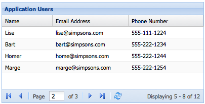
See the Paging Grid for a working example.
Buffered Rendering
Grids enable buffered rendering of extremely large datasets as an alternative to using a paging toolbar. Your users can scroll through thousands of records without the performance penalties of renderering all the records on screen at once. The grid should be bound to a store with a pageSize specified.
Only enough rows are rendered to fill the visible area of the grid with a little Ext.grid.plugin.BufferedRenderer#leadingBufferZone overflow either side to allow scrolling. As scrolling proceeds, new rows are rendered in the direction of scroll, and rows are removed from the receding side of the table.
Grids are buffered by default, so you no longer need to add the plugin to your grid component.
See Buffered Renderer for a working example.