
A Form Panel is nothing more than a basic Panel with form handling abilities added. Form Panels can be used throughout an Ext application wherever there is a need to collect data from the user.
In addition, Form Panels can use any Container Layout , providing a convenient and flexible way to handle the positioning of their fields. Form Panels can also be bound to a Model , making it easy to load data from and submit data back to the server.
Under the hood a Form Panel wraps a Basic Form which handles all of its input field management, validation, submission, and form loading services. This means that any of the config options of a Basic Form can be used directly on a Form Panel.
Basic Form Panel
To start off, here’s how to create a simple form that collects user data:
Ext.create('Ext.form.Panel', {
    renderTo: Ext.getBody(),
    title: 'User Form',
    height: 150,
    width: 300,
    bodyPadding: 10,
    defaultType: 'textfield',
    items: [
        {
            fieldLabel: 'First Name',
            name: 'firstName'
        },
        {
            fieldLabel: 'Last Name',
            name: 'lastName'
        },
        {
            xtype: 'datefield',
            fieldLabel: 'Date of Birth',
            name: 'birthDate'
        }
    ]
});
This form renders itself to the document body and has three Field s - “First Name”, “Last Name”, and “Date of Birth”. Fields are added to the Form Panel using the items configuration.
The
fieldLabel
configuration defines what text will appear in the label next to the field, and the
name
configuration becomes the
name
attribute of the underlying html field.
Notice how this Form Panel has a defaultType of ‘textfield’. This means that any of its items that do not have an xtype specified (the “First Name” and “Last Name” fields in this example), are Text Field s.
The “Date of Birth” field on the other hand has its
xtype
explicitly defined as ‘datefield’ which makes it a
Date Field
. Date Fields expect to only contain valid date data, and come with a
DatePicker
for selecting a date.
Fields
Field Types
Ext JS provides a set of standard Field types out of the box. Any of the Fields in the
Ext.form.field
namespace can be used in a Form Panel. For more information see the API documentaion for each Field type:
- Ext.form.field.Checkbox
- Ext.form.field.ComboBox
- Ext.form.field.Date
- Ext.form.field.Display
- Ext.form.field.File
- Ext.form.field.Hidden
- Ext.form.field.HtmlEditor
- Ext.form.field.Number
- Ext.form.field.Radio
- Ext.form.field.Text
- Ext.form.field.TextArea
- Ext.form.field.Time
Validation
1. Built-in Validations
Ext JS has built in support for validation on any type of Field, and some Fields have built in validation rules.
For example, if a value is entered into a
Date Field
and that value cannot be converted into a
Date
, the Field will have the
x-form-invalid-field
CSS class added to its HTML element.
If necessary, this CSS class can be changed using the
invalidCls
configuration. In the default theme, adding the
invalidCls
adds a red “invalid underline”:
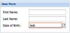
A Field containing invalid data will also display an error message. By default this message displays as a tool tip:
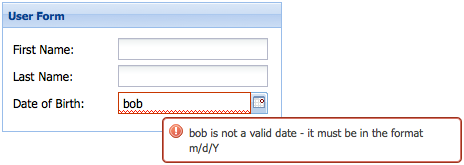
It’s easy to change the location of a Field’s error message using the msgTarget configuration, and the invalidText configuration changes the error message.
Each Field provides its own implementation of
invalidText
, and many support token replacement in the error message.
For example, in a Date Field’s
invalidText
, any occurrences of “{0}” will be replaced with the Field’s value, and any occurrences of “{1}” will be replaced with the required date
format
.
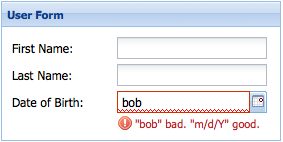
The following code demonstrates placing the error message directly under the Field, and customizing the error message text:
{
    xtype: 'datefield',
    fieldLabel: 'Date of Birth',
    name: 'birthDate',
    msgTarget: 'under', // location of the error message
    invalidText: '"{0}" bad. "{1}" good.' // custom error message text
}
2. Custom Validations
Some validation requirements cannot be met using the built-in validations. The simplest way to implement a custom validation is to use the Text Field ’s regex configuration to apply validation rules, and the maskRe configuration to limit which characters can be typed into the field. Here’s an example of a Text Field that validates a time.
{
    fieldLabel: 'Last Login Time',
    name: 'loginTime',
    regex: /^([1-9]|1[0-9]):([0-5][0-9])(\s[a|p]m)$/i,
    maskRe: /[\d\s:amp]/i,
    invalidText: 'Not a valid time.  Must be in the format "12:34 PM".'
}
While the above method works well for validating a single field, it is not practical for an application that has many fields that share the same custom validation.
The Ext.form.field.VTypes class provides a solution for creating reusable custom validations. Here’s how a custom “time” validator can be created:
// custom Vtype for vtype:'time'
var timeTest = /^([1-9]|1[0-9]):([0-5][0-9])(\s[a|p]m)$/i;
Ext.apply(Ext.form.field.VTypes, {
    //  vtype validation function
    time: function(val, field) {
        return timeTest.test(val);
    },
    // vtype Text property: The error text to display when the validation function
returns false timeText: ‘Not a valid time. Must be in the format “12:34 PM”.’, // vtype Mask property: The keystroke filter mask timeMask: /[\d\s:amp]/i });
Once a custom validator has been created it can be used on Text Fields throughout an application using the vtype configuration:
{
    fieldLabel: 'Last Login Time',
    name: 'loginTime',
    vtype: 'time'
}
See Validation Example for a working demo. For more information on custom validations please refer to the API Documentation for VTypes .
Handling Data
Submitting a Form
The simplest way to submit data to the server is to use the url configuration of Basic Form . Since Form Panel wraps a Basic Form, we can use any of Basic Form’s configuration options directly on a Form Panel:
Ext.create('Ext.form.Panel', {
    ...
    url: 'add_user',
    items: [
        ...
    ]
});
The Basic Form’s
submit
method can be used to submit data to the configured
url
:
Ext.create('Ext.form.Panel', {
    ...
    url: 'add_user',
    items: [
        ...
    ],
    buttons: [
        {
            text: 'Submit',
            handler: function() {
                var form = this.up('form').getForm(); // get the basic form
                if (form.isValid()) { // make sure the form contains valid data before
submitting form.submit({ success: function(form, action) { Ext.Msg.alert(‘Success’, action.result.msg); }, failure: function(form, action) { Ext.Msg.alert(‘Failed’, action.result.msg); } }); } else { // display error alert if the data is invalid Ext.Msg.alert(‘Invalid Data’, ‘Please correct form errors.’) } } } ] });
In the above example a button is configured with a handler that handles form submission. The handler takes the following actions:
- First a reference to the Basic Form must be acquired.
- Then the isValid method is called before submission to verify that none of the fields have validation errors.
-
Finally the
submitmethod is called, and two callback functions are passed -successandfailure. Within these callback functionsaction.resultrefers to the parsed JSON response.
The above example expects a JSON response that looks something like this:
{ "success": true, "msg": "User added successfully" }Binding a Form to a Model
The Model class is used throughout Ext JS for representing various types of data, as well as retrieving and updating data on the server. A Model representing a User would define the fields a User has, as well as a proxy for loading and saving data:
Ext.define('User', {
    extend: 'Ext.data.Model',
    fields: ['firstName', 'lastName', 'birthDate'],
    proxy: {
        type: 'ajax',
        api: {
            read: 'data/get_user',
            update: 'data/update_user'
        },
        reader: {
            type: 'json',
            root: 'users'
        }
    }
});
Data can be loaded into a Form Panel directly from a Model using the loadRecord method:
Ext.ModelMgr.getModel('User').load(1, { // load user with ID of "1"
    success: function(user) {
        userForm.loadRecord(user); // when user is loaded successfully, load the data
into the form } });
Finally, instead of using the submit method to save the data, Basic Form’s updateRecord method is used to update the record with the form data, and the Model’s save method is called to save the data to the server:
Ext.create('Ext.form.Panel', {
    ...
    url: 'add_user',
    items: [
        ...
    ],
    buttons: [
        {
            text: 'Submit',
            handler: function() {
                var form = this.up('form').getForm(), // get the basic form
                    record = form.getRecord(); // get the underlying model instance
                if (form.isValid()) { // make sure the form contains valid data before
submitting form.updateRecord(record); // update the record with the form data record.save({ // save the record to the server success: function(user) { Ext.Msg.alert(‘Success’, ‘User saved successfully.’) }, failure: function(user) { Ext.Msg.alert(‘Failure’, ‘Failed to save user.’) } }); } else { // display error alert if the data is invalid Ext.Msg.alert(‘Invalid Data’, ‘Please correct form errors.’) } } } ] });
Layouts
Layouts are used to handle sizing and positioning of components in an Ext JS application. Form Panels can use any Container Layout . For more information on Layouts please refer to the Layouts and Containers Guide .
For example, positioning fields in a form horizontally can easily be done using an HBox Layout:
Ext.create('Ext.form.Panel', {
    renderTo: Ext.getBody(),
    title: 'User Form',
    height: 120,
    width: 585,
    defaults: {
        xtype: 'textfield',
        labelAlign: 'top',
        padding: 10
    },
    layout: {
        type: 'hbox'
    },
    items: [
        {
            fieldLabel: 'First Name',
            name: 'firstName'
        },
        {
            fieldLabel: 'Last Name',
            name: 'lastName'
        },
        {
            xtype: 'datefield',
            fieldLabel: 'Date of Birth',
            name: 'birthDate'
        }
    ]
});